


Overview
The Storm Center team has released an updated layout for Storm Center maps. A preview of the new layout will be available in your test instances between September 16, 2019 and October 13, 2019. During this time, we will be collecting feedback about the layout changes. Please submit any feedback here. On October 14, 2019, all map views in all instances will be updated to use the new layout.
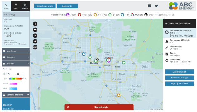
The new layout includes the following features:
1. Storm Center 5 map compliant with WCAG 2.1 AA:
- Changed product default colors to meet contrast requirements.
- Changed two regular outage icons and planned outage icons to improve distinction between icon shapes. Yellow pentagon is replaced with yellow star, and green hexagon is replaced with green square.
- Increased font size across the map user interface to improve legibility.
- Increased the size of the buttons to increase ease of access and improve legibility.
- Changed how hover states work on all buttons and alert banner. Hover states now add an outline and remove the background color.
- Updated font icons from Iconic to Font Awesome to provide more readable font icons and updated social media logos.
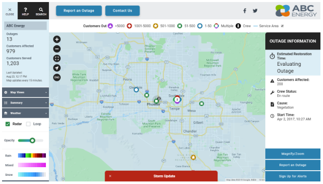
2. Other layout improvements:
- Use of rounded buttons to implicitly communicate they are clickable buttons.
- Information panel button placement moved to the bottom of the panel for desktop screen sizes for consistency with layout for mobile screen sizes.
- Updated labels on the WeatherBug legend for weather radar layer to improve legibility and match the labels used on the WeatherBug website.
- Updated front-end library components so the Storm Center 5 map user interface is consistent with other KUBRA applications.
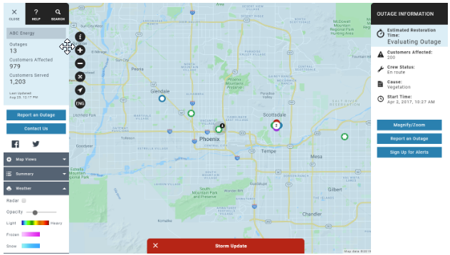
3. Feature improvements:
- New configuration option for summary report columns for mobile screen sizes separate from columns for desktop screen sizes.
- Added Earliest Start as a data field option for information panels associated with active outage clusters, planned outage clusters, and thematic data layers.
KUBRA used the Google Chrome Accessibility Checker, the WebAIM WAVE Evaluation Tool, and the Siteimprove Accessibility Checker to analyze the WCAG 2.1 AA compliance of the default Storm Center map user interface.
Release details
-
Prod Date:The preview will be available on your test instances starting on September 16, 2019. This update is planned to be released to production on October 14, 2019.
-
Type:Automatic - This release will not disrupt any current implementations. The preview mode will be available on all test instances. Instances that include the preview mode will see an option to view either the new preview layout or the previous layout whenever a user accesses a map view. The preview mode will not be shown on any map views connected to production or “critical” instances.
-
Notes:
- You should assign one or more employees to check the preview mode during the preview period for the test versions of all Storm Center maps your company is using to confirm that the changes are acceptable. KUBRA has updated and tested default color configurations, but has not tested every client configuration. The preview period is intended to allow for this implementation-specific testing.
- Configuration items that you might want to adjust:
- Button text labels in the tool panel and information panels for both desktop and mobile screen sizes. If a label does not fit on one line with the updated font size and button width, the text is wrapped onto a second line.
- Layer selection dropdown options in the menu content of the tool panel for both desktop and mobile screen sizes. If a label does not fit on one line, the text is wrapped onto a second line.
- Options in the layer selection dropdown when selected. If a label does not fit on one line with the updated font size, the extra characters will be hidden and indicated with an ellipsis character (...).
- There may be other field text labels that wrap to a second or third line if the text does not fit due to the increased font sizes.
- Interface colors related to text and text backgrounds. KUBRA has changed the default color configuration to comply with the more stringent contrast requirements of WCAG 2.1, level AA, but has not checked individual client configurations for compliance.
- For existing implementations, please contact your KUBRA CRM to discuss any desired configuration changes.
- For in-progress implementations, please contact your KUBRA Project Manager to discuss any desired configuration changes as part of your regular project meetings.