


Overview
A new design has been implemented for the Storm Center map layout. This new design incorporates best practices in modern web design and applies feedback received in the past year from our utility clients. As a result, the new layout will increase the usability of Storm Center maps and customer satisfaction.
A preview mode with these changes will be released to all development and test instances and maps for all Storm Center 5 implementations.
The new layout changes will be rolled out to production instances and maps four weeks after the release of the preview mode. The purpose of the preview period is to give clients time to review and test the layout updates in their test maps as they apply to specific configurations. If a client finds any items they would like to adjust, the preview period also allows the client to request configuration updates before the release is applied to their live, public-facing maps.
The Improved Layout
New layout features:
-
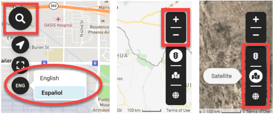
Some of the map buttons have been repositioned to facilitate user interaction:
- Search address and bookmarks are now accessible from a map display options button instead of a section of the tool panel. This gives users direct access to these frequently accessed features.
- The available options for language selection are now presented next to the language selection button, so users have a shorter distance to navigate to select a new language.
- Zoom buttons are now placed in a similar location to Google Maps. This helps users by presenting a familiar interaction pattern.
- Background map type selection has been simplified and designed to reduce the number of clicks needed to change the background map between road, satellite, and hybrid options.
-
Alert messages, summary report details, and search and bookmark features are now presented as modals, focusing the user’s attention on the active task while maintaining the context of the map in the background.
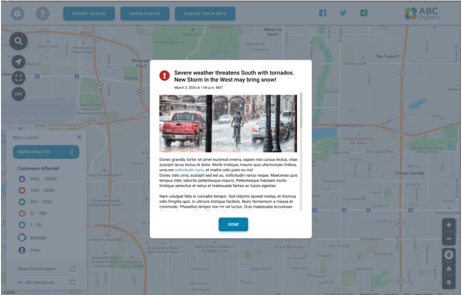 Alert message
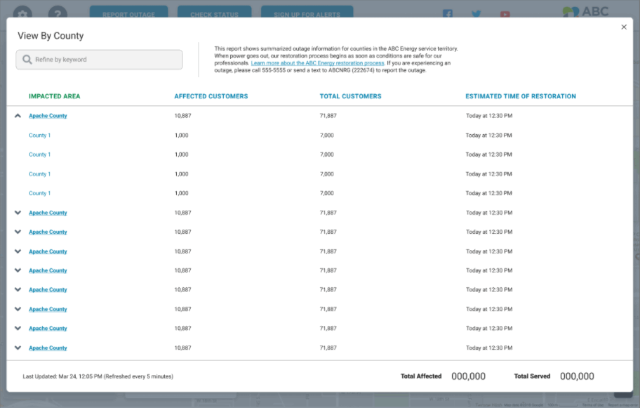 Summary report details
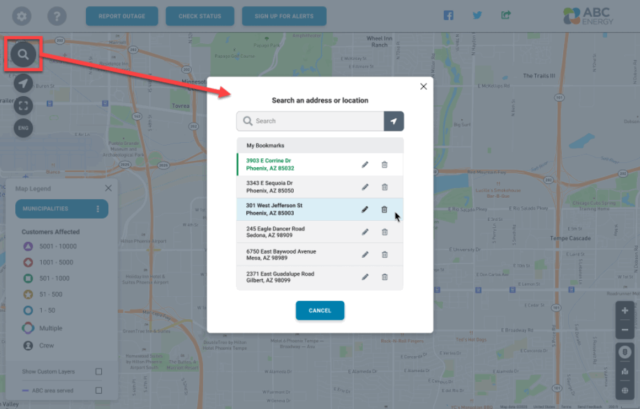 Search and bookmarks
 -
The Overview Panel, the Help Panel, the Map Legend, and the Information Panel are now presented using a card layout. Cards help to reduce visual noise and solve many of our previous layout restrictions. Cards also allow us to better maximize the available screen space. For example, the new Map Legend layout supports more icons than the previous layout, and the new information panel for outage clusters supports individual outage information cards instead of pagination at the closest zoom levels.
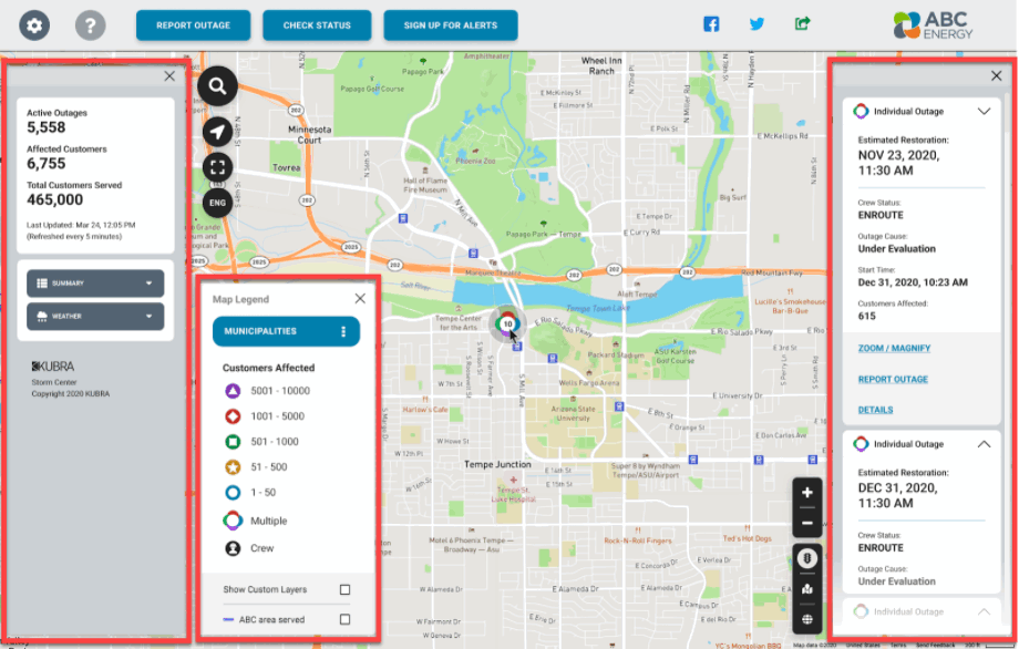 From left to right: Overview Panel, Map Legend and Information Panel
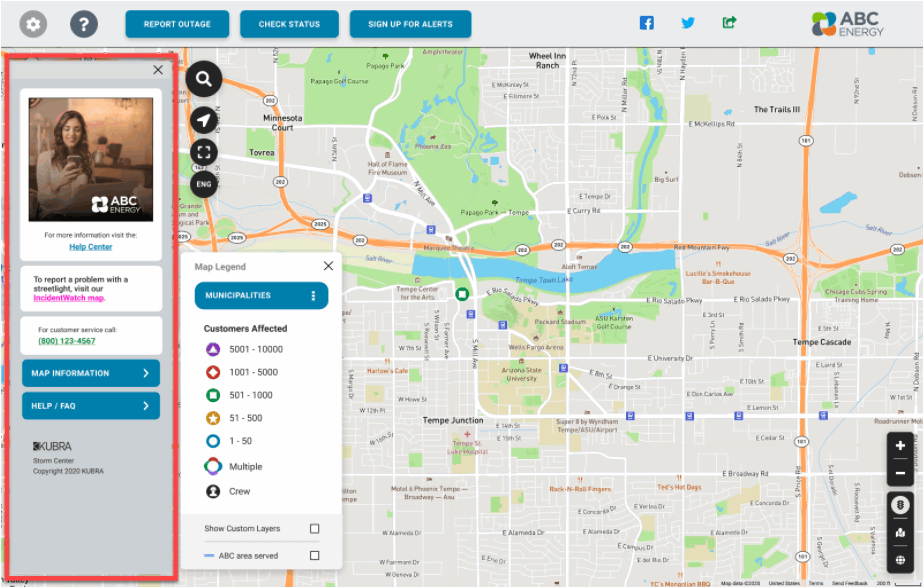 Help panel
 -
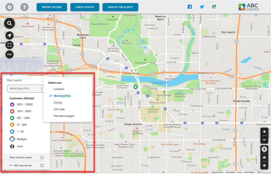
The Map View selection is now connected to the Map Legend. This allows the user to see in context the selected map view and its associated icons or shading colors. This method of selection is much more accessible and reduces the number of clicks required to select a map view option.
-
New and enhanced features for the Alert Banner.
In the last year, we received feedback from multiple clients regarding the Storm Center Alert Banner. These requests were focused on several key aspects:- Make the alert more prominent.
- Provide more flexible options for how alerts can be displayed on the map.
- Allow more control over the presentation of the alerts.
To support these requests, we have updated the alert banner design and added multiple self-service configuration options to the Alert Banner app in the Storm Center management console (Control Center).- For each alert, there is an option to configure whether the Alert Message will be opened automatically when a user first loads the map page. This allows critical message details to be more visible to map users.
- For each alert, there is an option to locate the Alert Banner at the bottom or top of the map. We have aligned the alert to the right side of the map to avoid overlapping other map elements. We have also increased the size and clarity of the font used in the alert banner.
- For each alert, there are options to configure the alert banner background color and font color. This will allow the utility to configure different types of alerts for different use cases, such as an emergency-related alert vs. an informational alert.
Additionally, the Alert Banner app will allow utilities to create up to 10 pre-configured alert options.
We are also replacing the current rich-text editor (WYSIWYG HTML editor) for the alert message field with a new and more versatile one. The rich-text editor will be unchanged during the preview period. The new rich-text editor will include similar options as the existing editor when the new layout is released to production, and will allow us to add support for other features such as tables and videos in the future.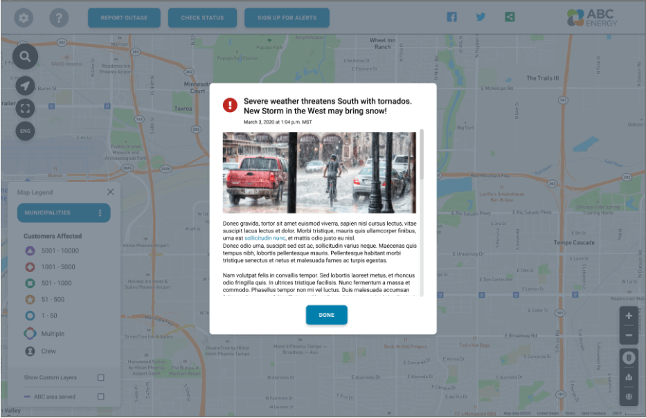 Alert message
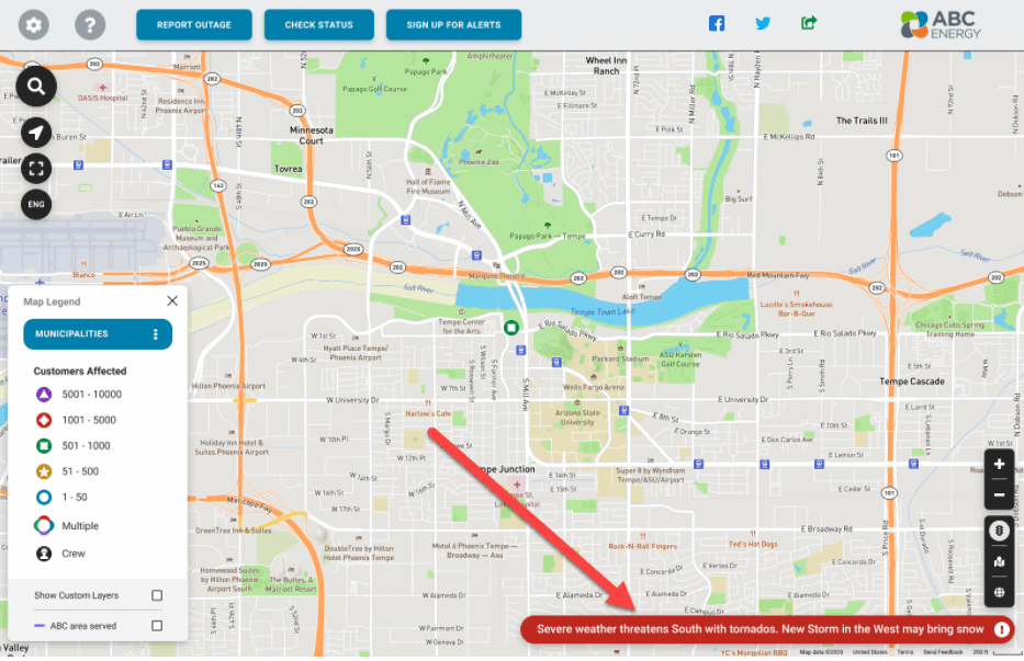 Alert banner at the bottom of the map with default color
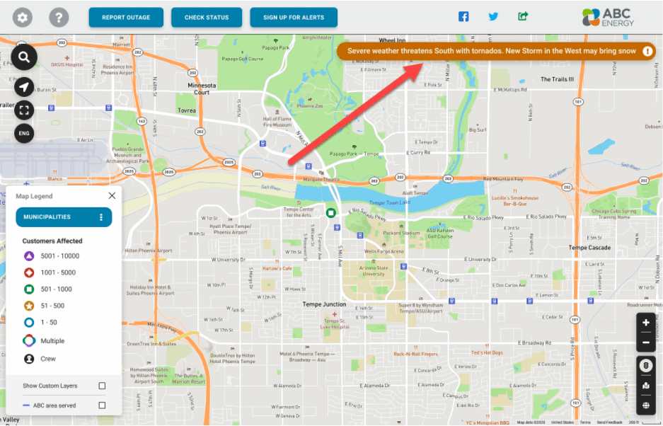 Alert banner at the top of the map with a custom color
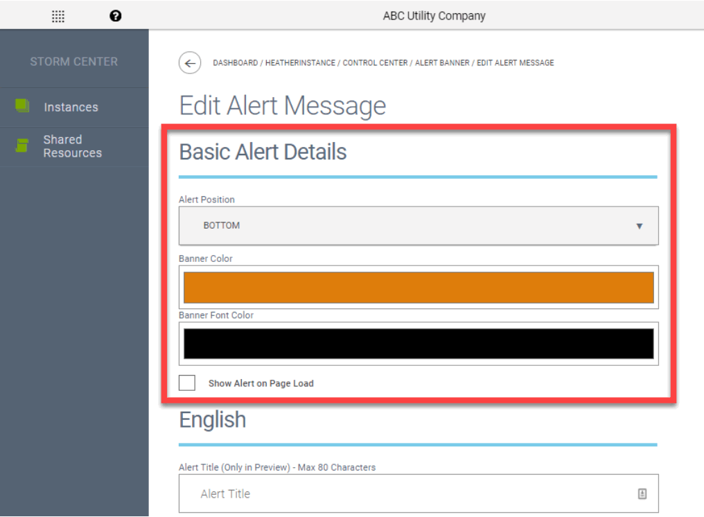 New Alert Banner configuration options in Control Center
Colors and Styles
We have simplified the management of colors and styles to better align with the new UI components and simplify the setup and configuration process. The overall number of color configuration fields has been reduced. Thanks to this optimization, map implementations and future map maintenance efforts will be sped up considerably.
Reducing the number of separately managed colors used in the new map design will allow maps to better comply with guidelines for accessibility for people with visual impairments. Specifically, configuration choices that might hurt the legibility and display of fonts may be corrected automatically in the new design. Additionally, the use of cards in the new design allows for more diverse color palettes to be used in areas that were restricted in the previous layout. Reducing the number of color configurations to 14 also aligns with the way organizations currently using Storm Center apply their branding to Storm Center maps, because most organizations do not have more than 10 brand colors.
All of the color configurations from the previous design will be mapped automatically within the new design, including the configured utility branding colors. As a result of this mapping, there should not be any considerable impact on the branding or new UI component colors. However, there is a chance that some UI components may not meet aesthetic expectations when mapped to the new design.
Browser Support
The new Storm Center map layout design will continue supporting the same browsers and versions as the previous layout (full list available at https://docs.kubra.io/storm-center/#supported-browsers).
The new map design will be operative and functional in Internet Explorer 11 (IE 11). However, it might not deliver the best user experience for the customer and might have some UI differences. This is due to the legacy status of IE 11, which does not support many of the modern web and security standards. IE 11 is expected to be deprecated in a future release of Storm Center. As in the current map design, IE 11 in “compatibility view” is not supported.
Also, the new map design has been optimized to deliver the best user experience on mobile devices with screen widths of 360 pixels or more and screen heights of 568 pixels or more. Older mobile devices with screen resolutions under 360 pixels wide or 568 pixels high might not deliver the best user experience with the new design, but these devices are not commonly used.
Recommended Actions for Clients
- Identify one or more stakeholders who work for the utility who can check the new layout against the previous layout during the four-week preview period.
- When the preview starts and during the four-week preview period, the identified stakeholders can look at the map in the new design and check that the colors in the new design look good. Otherwise, the utility stakeholders can contact their KUBRA CSM, who can work with the KUBRA team to make any necessary adjustments.
- If the utility has Storm Center maps integrated with a third-party mobile app, the utility will need to work with the third-party app provider to check the new design in a test app. To test the new layout design in the test app, the test app must be connected to the test map URL. All KUBRA mobile test apps with an embedded Storm Center map are already using the test map URLs. For the new map layout, all map URLs will remain unchanged for test and production maps, so if the native mobile apps are using the appropriate URLs, no changes will be required.
- Update any help documents, videos, or images on the utility’s website that reference the old design with the new design.
When the new map design in preview mode is released to all Test outage maps, KUBRA will send a form where you can let us know
- if you would like to provide any feedback about the new layout once it is available in your Test map,
- if you have any questions or concerns about how specific things work in the new layout, or
- if you want to report any possible issues or bugs you may identify in the new layout during the preview period.
Release Details
- Preview and Production Dates: The preview will be available on test maps starting on November 16, 2020. The new design will be released to all production maps on December 14, 2020.
- Type: Automatic - This design update will not disrupt any current implementations. Existing configurations will be maintained as much as possible. Clients can check configuration appearance during the preview and may request configuration changes if desired. For more information about the release process for the different types of releases of the Storm Center product, please visit https://docs.kubra.io/release-process/.
-
Notes:
- We recommend that you use the preview period to double-check color configuration and branding as well as configured buttons, links, and content to confirm that they appear as desired with the new design.
- For existing implementations, please contact your KUBRA Client Success Manager to discuss any needed configuration changes.
- For in-progress implementations, your KUBRA Project Manager will include discussion of any needed configuration changes in regular project meetings.